Whether you’re a small consulting business or a large nonprofit focused on animal welfare, your website is a mission-critical marketing and engagement tool for your organization. This is where you create content that is useful for your audience, house important resources and tools your customers or supporters can leverage, and more.
And since you’ve invested a lot of time and effort into creating and optimizing your website, you want to make sure it’s doing its job effectively. That’s where web engagement data comes in. This data tells your organization how your target audience is interacting with your website.
In this mini guide, we’ll walk you through how to track your engagement data and, most importantly, how to interpret it and elevate your website’s performance. Let’s begin!
How to Track Web Engagement Data
One of the best tools for measuring and tracking web engagement data is Google Analytics. When Google Analytics is connected to your website, you can easily collect information about the people who visit your website and how they behave on it (more on this later).
According to Cornershop Creative, here’s how to get started with Google Analytics for your own website:
- Sign up, create your Google Analytics property, and use the Setup Assistant to build your account.
- Create conversion events that will allow you to monitor key actions like donating, making a purchase, registering for events, and email sign-ups.
- Set up custom events so you can track other important actions users take on your site.
From there, you can view the data you collect with the Explorations tool and build out custom reports that look at the metrics your organization is most interested in.
In addition to using Google Analytics, note that your website builder might offer built-in analytics tools that help you gain further insights into your website visitors.
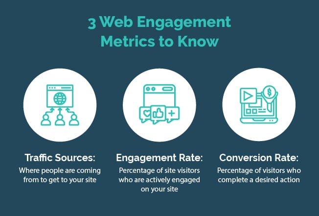
Now, let’s look at three key web engagement metrics and explore how you can interpret them effectively.

1. Traffic Sources
This web engagement metric tells you where people are coming from to get to your website. There are six typical sources of web traffic:
- Direct traffic: Site visitors who type your website URL directly into their browser or click a bookmark
- Organic search traffic: Visitors who click on your site from search engines like Google, but not through paid ads
- Paid search traffic: Visitors that click on a paid ad placed on a search engine for a specific search term
- Referral traffic: Visitors who arrive on your site through a link on another website
- Email traffic: Visitors who click on a link to your website in an email
- Social traffic: Visitors who arrive on your website after clicking a link in a social media post or bio
Research shows that 53.3% of all web traffic comes from organic search, meaning that most people who visit your site will type something into Google and click on your website link because it looks like it might match what they’re searching for.
How do I interpret traffic sources?
Once you start collecting information about how your website visitors are getting to your site, you can think more strategically about the best ways to increase traffic from those sources. Check out these potential examples of using this information to your advantage:
- You observe that most visitors to your nonprofit’s donation page are coming from Instagram. Knowing this, you decide to include more donation appeals in your Instagram posts and stories.
- If you notice that most of your website’s traffic is coming from organic search, you might make the flow of traffic more airtight by optimizing your most important pages for specific keywords relevant to your organization and its offerings.
- Perhaps paid search traffic is your nonprofit’s most prominent website traffic source. Knowing this, you might apply for the Google Ad Grant, which can help you connect with the people who want to be a part of your work but wouldn’t otherwise know that your organization is out there.
Of course, just because you’re working to increase traffic from one source doesn’t mean you should give up on other sources! Avoid putting all of your eggs in one basket. Instead, spread out your efforts so that you’re still generating traffic from a variety of sources, even if you’re focusing more heavily on one main channel for a time.
2. Engagement Rate
Engagement rate is a pretty simple website engagement metric. It tells you the percentage of site visitors who are actively engaged on your website. Google Analytics measures engagement by tracking:
- Sessions in which one page view lasts 10 seconds or longer
- Sessions that trigger an event
- Sessions that have two or more page views
Fathom Analytics provides the following information about what constitutes a good engagement rate: “On websites and online businesses, on average, a good engagement rate is somewhere between 60% and 70%.”
How do I interpret engagement rate?
If you notice your engagement rate is in the lower range noted above, you should work to increase it. After all, a low engagement rate means people aren’t getting everything they could be getting out of your site. Here are a few tips to catch your audience’s attention and keep them exploring your site and its resources:
- Create high-quality content. Your web content should make people want more. With written content especially, you should work to create content that is easy and entertaining to read. Tap into the humanizing element of content creation by leveraging your brand voice and always having empathy for your audience.
- Make sure your website provides a great user experience on mobile devices. Have you ever had to “pinch and zoom” to look at a website on your phone or tablet? It can be a frustrating experience, especially when it’s difficult to tap buttons or exit out of improperly sized pop-ups. Ensure your website is ready for visitors using any device so that they can explore your content even when they’re on the go.
- Optimize for accessibility. To make sure that your website is meeting web accessibility standards, ensure that all of your written content has a clear heading hierarchy that can help visitors who are navigating using screen readers. You should also include alt text on images and captioning or transcripts for multimedia elements like videos. You can even add an accessibility widget to your website, empowering visitors to change site coloring to grayscale or adjusting fonts to be more readable.
One last note on engagement rate: If your engagement rate on a particular page seems low, don’t panic! Do a little digging to understand the context. If your nonprofit’s blog has a low engagement rate, it might be because you haven’t posted in a while. Or, if your “Events” page has a low engagement rate, it might be because people are only looking for last-minute information ahead of the day of a big event. The context for low engagement rates will show you how concerned you should be about increasing the rate for individual pages.
3. Conversion Rate
Conversion rate tells you what percentage of website visitors have completed a desired action. You can think of conversion rate as the percentage of website visitors that turn into customers or supporters of your brand or mission.
The desired action that your visitors complete could take a variety of forms. Here are a few examples:
- Downloading a whitepaper
- Making a donation
- Purchasing a product or service
- Sending a charity donation holiday eCard
- Filling out a contact form or demo request
- Signing up for an email newsletter
- Sharing a blog post on social media
Of course, you want your conversion rates to be as high as possible, but this is where it gets a little subjective. Average conversion rates differ based on everything from visitors’ location and the year to what specific action you’re looking at. However, general site-wide conversion rates should land between 2% and 5%, whereas action pages like donation pages usually have a conversion rate of 17%.
How do I interpret conversion rate?
Your conversion rate tells you if your action pages or even basic calls-to-action (CTAs) are accomplishing what you want them to. Once you’ve been tracking conversions for your highest-priority action pages for a while, you’ll have a good sense of your page’s typical performance, which can give you a starting point as you try to improve it.
To improve conversion rate on your action pages, make sure your written content is strong. For example, if you have written CTAs, are they engaging? Do they actually make people feel compelled to act?
You should also optimize any forms that you’re using to complete conversions. Make them easy to use, with minimal steps for the user and a cohesive, secure experience that will provide them peace of mind (especially if they’re making a purchase or donation).
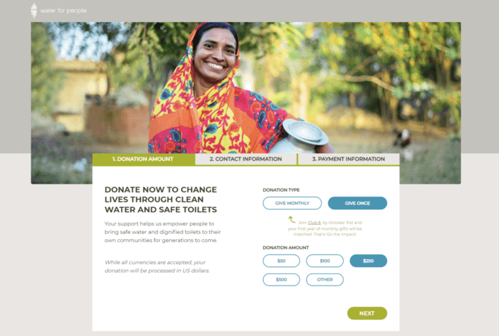
Here’s an example of a nonprofit donation form that has a strong design:

Water for People’s donation form has a sleek visual design that’s easy for donors to navigate. It’s also user-friendly with easily-clickable buttons, making the donation process simple and convenient. Both of these characteristics make this form ideal for helping increase this organization’s donation page conversion rate!
If you have a new version of an action page that you want to try out but aren’t sure if it’s ready for your website’s audience, consider doing an informal A/B test. Have one group of employees at your organization use the old version of the page and another group of employees use the new version. Then, ask both groups to report back on their experience. You can then use their suggestions to strengthen your new action pages before pushing them live, giving you a better chance of raising your conversion rate right off the bat.
Understanding and being able to interpret web engagement data is the key to milking all the value you can out of your organization’s website. As you continue to familiarize yourself with the three metrics we’ve covered here (and measure and improve them on your own website), don’t be afraid to learn about and measure others, like pageviews or session duration.
The more information you gather about your website’s performance, the better! Remember to always dig deeper to understand the context for the numbers you’re seeing. Then, make intentional improvements to your website that will more fully engage your target audience when they find you online. You’ve got this!
 Sarah Fargusson – Director of Digital Strategy at Cornershop Creative
Self-described as a “non-profit junkie,” Sarah has dedicated her career to serving the needs of the non-profit sector. Her project management experience spans a variety of non-profit management disciplines including strategic planning, community engagement, capacity building, fundraising and research. She has worked both in and for the non-profit sector at the Feminist Majority Foundation, the Sadie Nash Leadership Project, and the consulting firms The Lee Institute and The Curtis Group. With her ever expanding non-profit tool belt, Sarah joined Cornershop Creative to tap into her techie, creative side, while developing meaningful partnerships with her clients to help them more effectively achieve their goals.


0 Commentaires